A special guest post today from my father, Stan Berkson (check out his blog). You’ve heard me quote him on blogs and in Twitter. Working for Moody’s in the latter half of the 20th Century he was an early adopter in enterprise typesetting technology. He has been an inspiration and enthusiastic supporter since we played with our TRS-80 Model I back in 1979. When we upped it from 4k to 16k we thought “we’ll never write a program big enough to fill 16k!” His career spanned the advent of computers for commercial use through mainstream usage of personal computers. And he’s forgotten more about typesetting, layout and design that most people will ever know.
It goes without saying that creating documents today on a computer is extremely fast, with most projects taking only an hour or two—sometimes only a few minutes—instead of days. When I began doing newsletters for the school attended by my kids, the typesetting device was a typewriter. All submissions were provided to me on paper, either typed or handwritten and had to be typed (no email or flash drives; not even floppies).
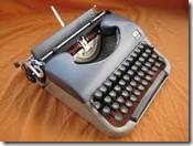
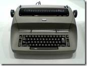
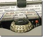
We used an electric IBM Selectric typewriter. This was special in that the characters, similar to today’s fonts, were proportionate, a significant improvement over the monospaced machines that were made by companies like Underwood. Such early typewriters used arms with molded characters at the end to strike a fabric ribbon. The newer IBM machine used a carbon paper ribbon and a ball containing the alphabet. The choice of fonts was limited.
But that was not the only limitation.
Alignment: No left, center, right, and justified alignment.
Font attributes: No bold, italic, or underlining. To underline required backspacing and using the underline key. No small caps, subscript, or superscript.
Flow text around photo: ROTFLMAO
Line wrap: A hard line return was required to end every line.
Indents and tabs: Only left tabs (no center, right, or decimal). First-line indents required a tab. Hanging indents and right indents had to be done manually.
Inter-line and inter-paragraph spacing: Fugeddaboudit!
Backspace and delete: Backspace did not delete (only moved the typing element backwards). Deleting required “White Out” or “Liquid Paper” correction fluid. When it dried, you typed over it.
Spell and Grammar Check: Good eyes and a brain
Column and Page Breaks: No such thing. Everything was typed in galley format (like a roll of toilet paper).
Cut and Paste: Sharp knife and rubber cement.


